

INARI
May 1, 2023
It is in a true sense a gateway to experience the food which is the same old Indian touch, but better. It intends to revive and renovate Indian food’s soul in its authentic form that will surely take you down memory lane.
To come up with something ‘out-of-the-box’ for this overachiever brand was as challenging as it was fun. Let’s embark on the journey of how we made this quirky Indian restaurant stand out with some awesome and thoughtful branding.
Task
INARI spans the timeless Indian food culture and weaves it beautifully with the contemporary food style to offer everyone who crosses its threshold an explosive mouthfeel, with an undertone of zesty Indian spices and artistic modern culinary skills
Strategy
Brand Story,
Market Research,
Visual Strategy,
Growth Hacks
Design
Logo, Menu,
Coaster, Napkin,
Wall, Glassdoor
Sticker, Feedback
Form, Branding &
Packaging
Tags
Brand Image,
Branding,
Logo Design,
Packaging


⬤ 01. LOGO
Our vision was clear. To make a clean, minimal logo that eludes the fusion of modern and Indian.
We wanted the logo to remind the consumer of the Indian roots of INARI, and also to give a modern vibe. With that thought was born the mix-match combination of using Devnagri and English script to create the logo typography. The expanding tree with overgrowing branches is reminiscent of our evergreen food culture that defies time and space.


⬤ 02. MENU
The menu was rustic, yet contemporary.
The cutouts of dishes and imagery related to the day-to-day life of a simple Indian were added in the form of a nouvelle collage to bring the quirky pop hues to the menu, symbolizing how our food seamlessly blends with our everyday life.


⬤ 03. COASTER
We blended the abstract art form with the INARI logo to create a coaster that emanated luxury and subtle finesse, making the whole feel get etched in the customer’s heart.
.jpg)
⬤ 04. NAPKIN
No Indian meal is finished without a punch of humour that relaxes the mood and makes one feel lighter. We wanted to incorporate this tradition in our branding, and hence napkin with witty punch lines was crafted.


⬤ 05. WALL
Keeping with the minimalist representation and with the modish vibes, the wall was designed. The overall architectural grammar had an Indian touch with a dash of modernity to create a luxurious and state-of-the-art ambience.


⬤ 06. GLASSDOOR STICKER
Adding elements that go with the brand location and architecture, for instance, Chandigarh’s iconic monuments and emblems and plants used in interior landscaping. Every element is designed to attune with the luxurious premium vibes of the brand and create a recall value
.jpg)
⬤ 07. FEDDBACK FORM


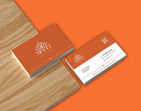
⬤ 08. VISITING CARD

⬤ 09. BRANDING & PACKAGING
The overall branding was designed keeping in mind the premium, rooted in the traditional vibe of the brand with a touch of a modern feel with minimal abstract elements.
.jpg)
⬤ 10. CARRY BAG


Color palette
Smoky Black
#0A0203
R 10
G 2
B 3
SCSS var
$color-black
◯
Smoky Black
Halloween Orange
#F265229
R 241
G 101
B 40
SCSS var
$color-orange
◯
Halloween Orange
Want to discuss a new project ?
Get in Touch
Ready to work together?